
CAPSE landing page for enterprise voice AI.
SEO
100
Acessibility
90
Year
2026
Optimize
82
Ho Chi Minh
Target Audience
Founder
Role
Web Design | Framer
In Short
Case Study
Challenge
In a category where almost every site looks the same product screenshots dropped into a feature grid give an AI voice SaaS a landing page with genuine brand character, without losing product clarity.
Approach
visual system large type, one disciplined accent, asymmetric layout and let the product appear as proof inside that narrative. Brand first, evidence alongside.
Show it working
Key decisions
01 – 05
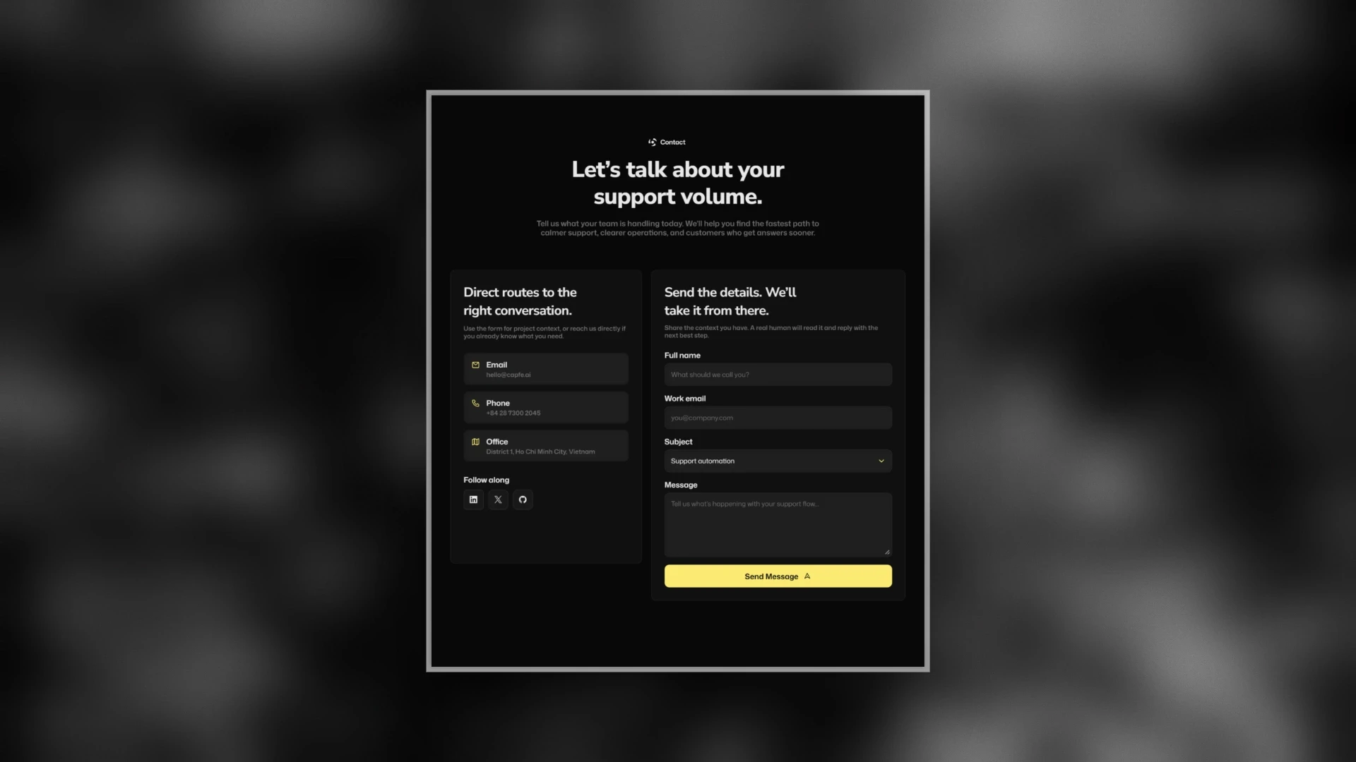

03
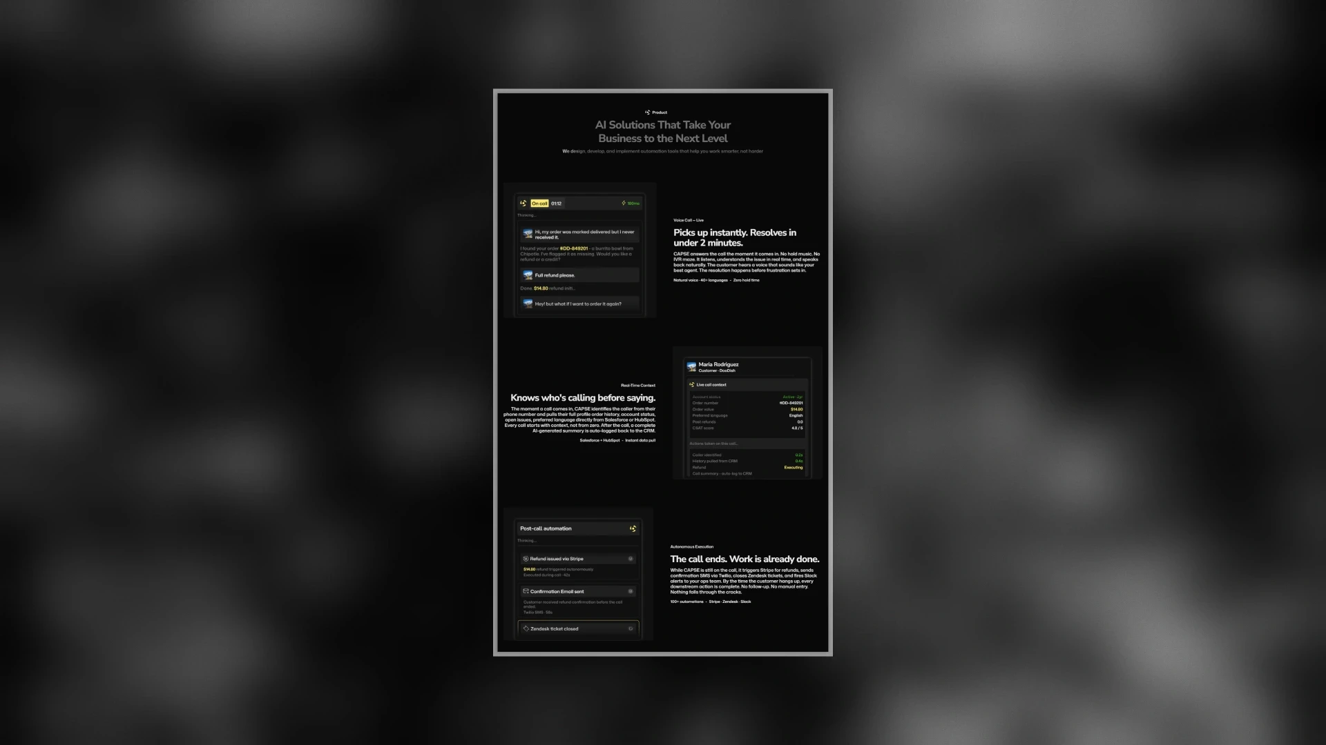
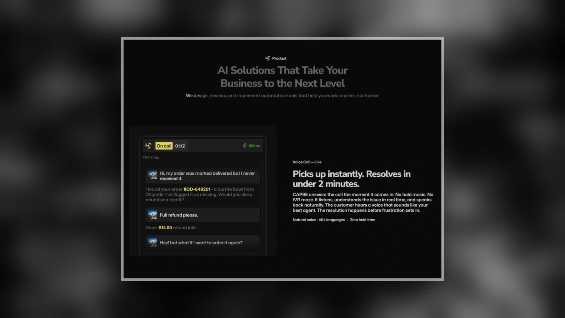
Product shown as proof.
A live on-call card, a CRM-context panel, and a post-call automation feed keep the concept concrete, so the brand-led approach still demonstrates what the product actually does.
Story and evidence, together.
04
Long-form case study with a sticky meta column.
A founder note, a belief list, and a long-form case study with a sticky meta column give the site weight and a clear point of view the substance that makes a brand feel real.
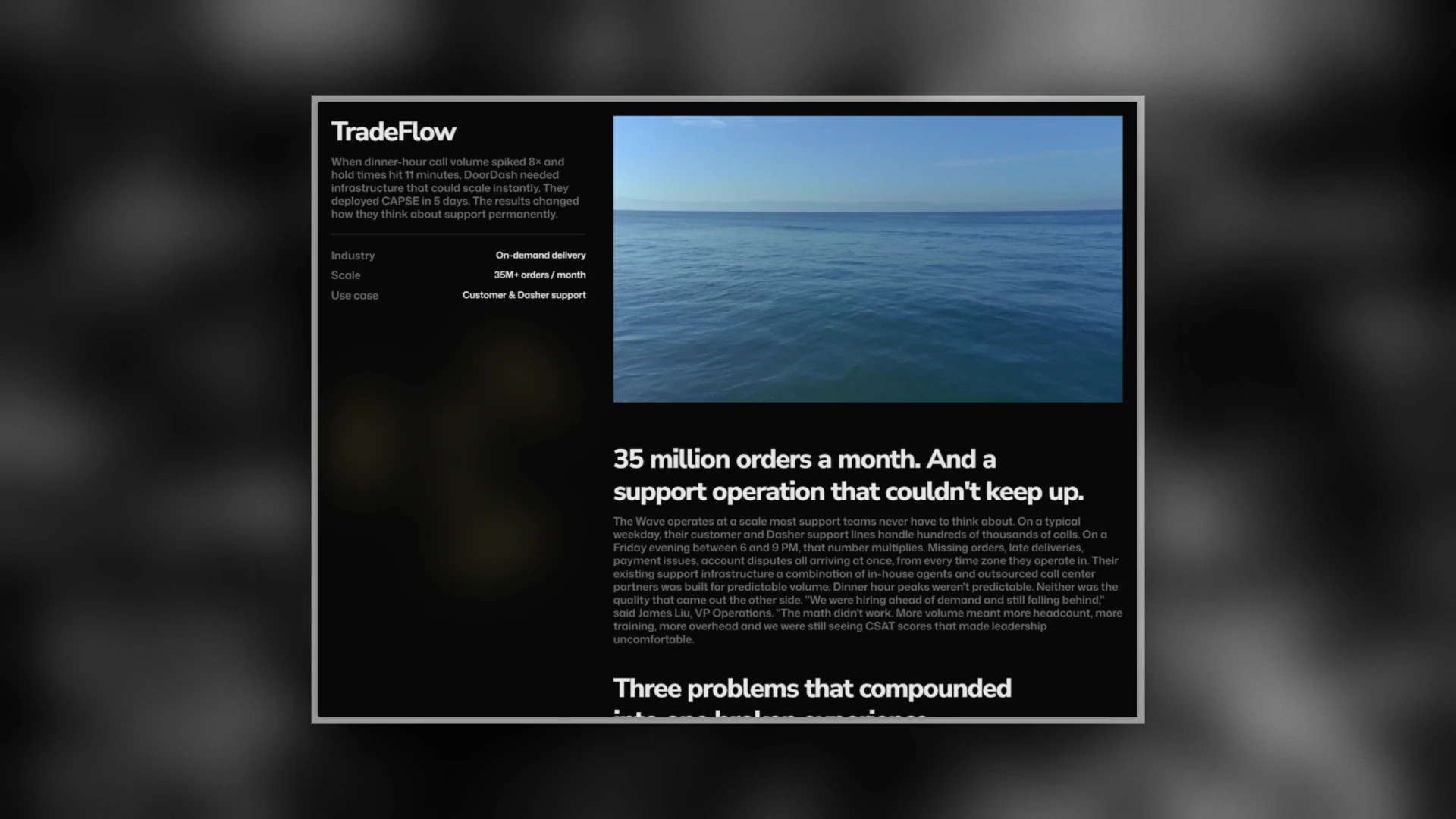
Depth that makes the brand feel real.
05
Reponsive Every Screen
A mobile-first layout that keeps the type-led hierarchy, the single accent, and the product proof intact from desktop down to phone nothing dropped, nothing cramped.
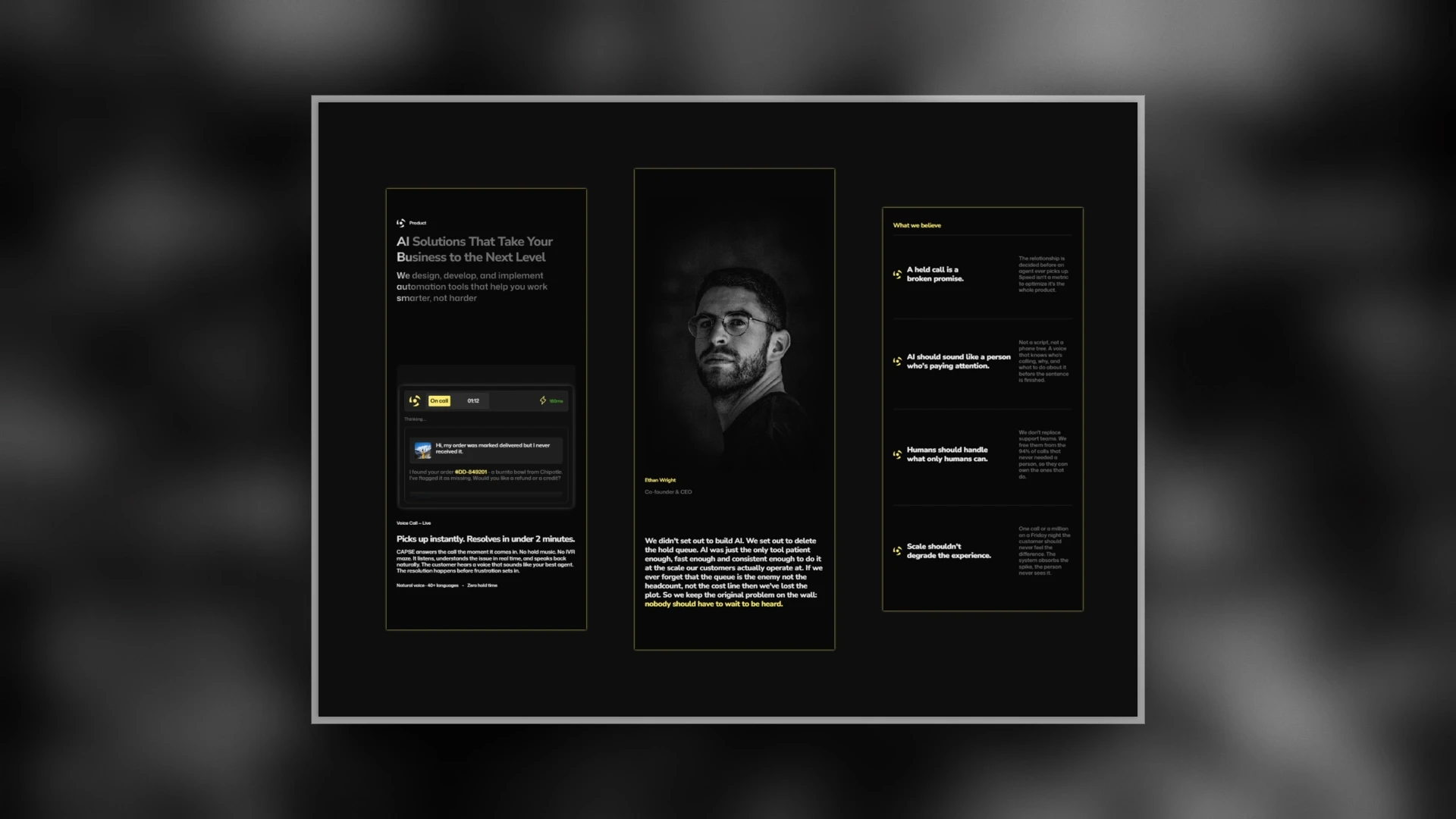
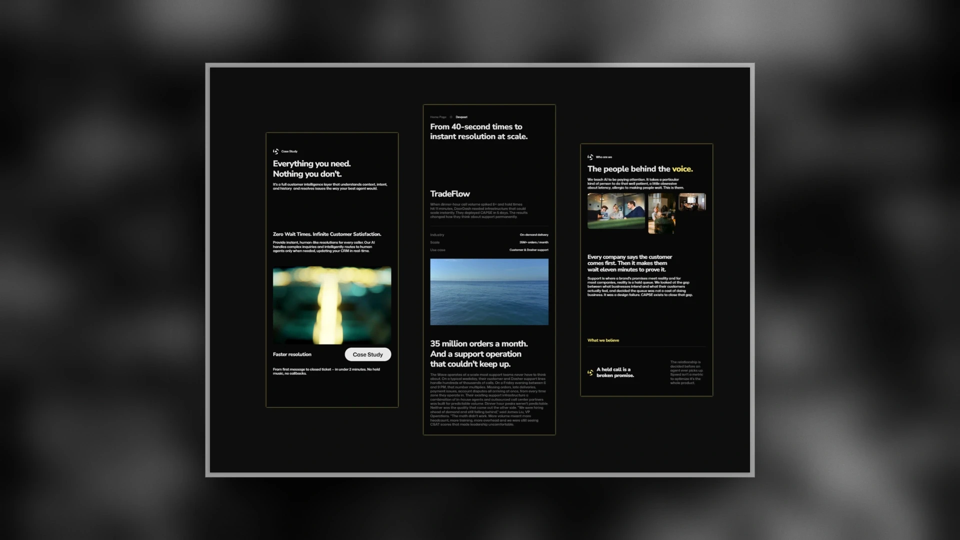
Same brand, every screen.
Tradeoff
The safe route was the familiar feature-grid quick to scan and exactly what buyers expect. I chose the editorial direction to give the brand a distinct identity, and kept the product visible throughout, so nothing was lost by standing out.
Result
A landing page with a distinct, premium identity in a category that mostly looks alike brand-led, product-proven, and responsive across every screen. Designed and shipped end-to-end in Framer.
Available on the marketplace